Woo Product Grid
Arrange the products in a grid format! This Woo Product Grid will enhance the product arrangement for users and viewers!
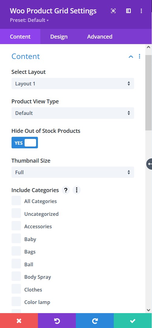
Content tab → Content
- Select Layout – pick from the six trendy layouts
- Product View Type: Select a product view type from default, latest products, best selling, and all the way to product category. These will help you define how you want the products viewed.
- Hide Out Of Stock Products – hide or let view the out of stock products
- Thumbnail Size – pick a size for the image thumbnail
- Include Categories – select the categories you want to show or select all categories to show all the products added
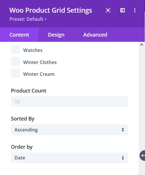
Content tab → Content
- Product Count – number of products to be viewed
- Sorted By – sort the products by either ascending or descending order
- Order By – There are at least 7 ways to order the products, select the one you prefer.
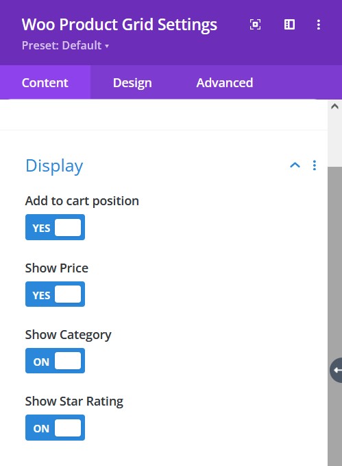
Content tab → Display
- Add To Cart Position – enable to show add to cart
- Show Price – enable to show the price of a product
- Show Category – enable to show the category
- Show Star Rating – enable to show the star rating
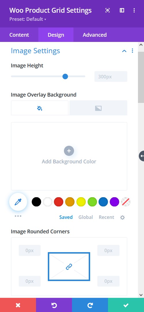
Design tab → Image Settings
- Image Height – adjust the height of the images
- Image Overlay Background – Add an overlay background fill color or gradient on top of the image
- Image Rounded Corners – include rounded corner by adjusting the four corners
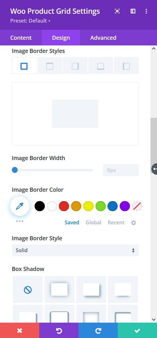
Design tab → Image Settings
- Image Border Styles – add a border to any side you like or have borders on all four sides
- Image Border Width – adjust the width of the border
- Image Border Color – select a color for the border
- Image Border Style – include a style to the border
- Box-shadow – add a box-shadow to the element
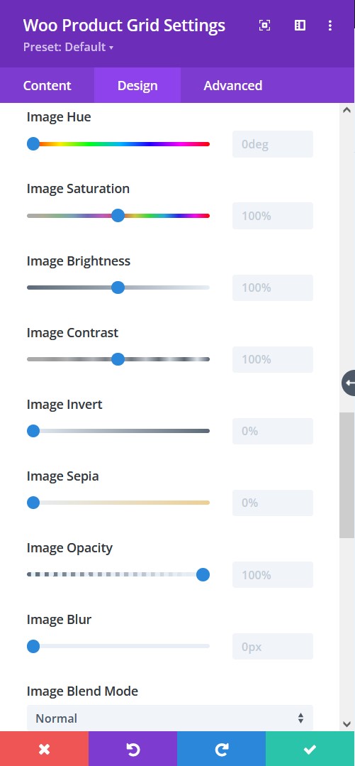
Design tab → Image Settings
- Image Hue – adjust image hue using the slider
- Image Saturation – adjust the intensity of the image
- Image Brightness – configure the brightness of the image
- Image Contrast – include contrast to the image
- Image Invert – use this to shift to an inverted image
- Image Sepia – adjust to apply sepia color tone to the image
- Image Opacity – adjust the opacity of the image
- Image Blur – add blur to the image
- Image Blend Mode – Select from the 16 types of image blend mode for a quick configuration
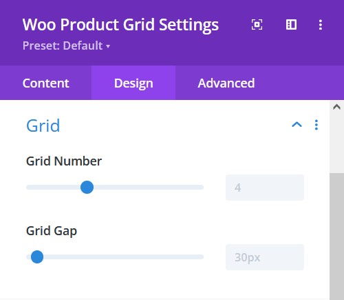
Design tab → Grid
- Grid Number – adjust the slider to measure the grid number
- Grid Gap – adjust the gap between the elements
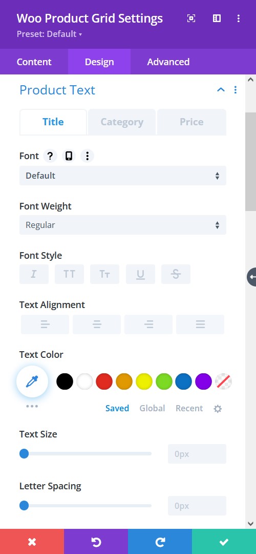
Design tab → Product Text
- Font – Choose a font. All Google web fonts are available here. You can upload a custom font as well.
- Font Weight – select the weight of the font from Light to Ultra Bold
- Font Style – select a font style from
- Text Alignment – align the text to left, right, or center
- Text Color – pick a color for the text
- Text Size – resize the text
- Letter Spacing – Adjust the spacing between the letters of the text
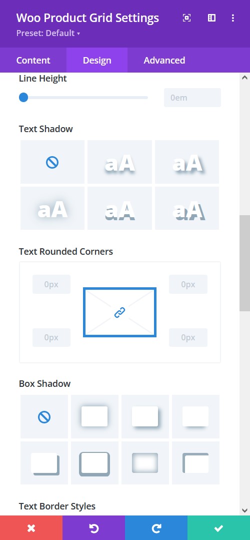
Design tab → Product Text
- Line Height – adjust the space between multiple lines added to the design
- Text Shadow – add a shadow to the text
- Content Wrapper Rounded Corners – include rounded corner by adjusting the four corners
- Box-shadow – add a box-shadow to the element
- Border Styles – add a border to any side you like or have borders on all four sides
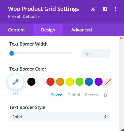
Design tab → Product Text
- Border Width – adjust the width of the border
- Text Border Color – select a color for the border
- Text Border Style – include a style to the border
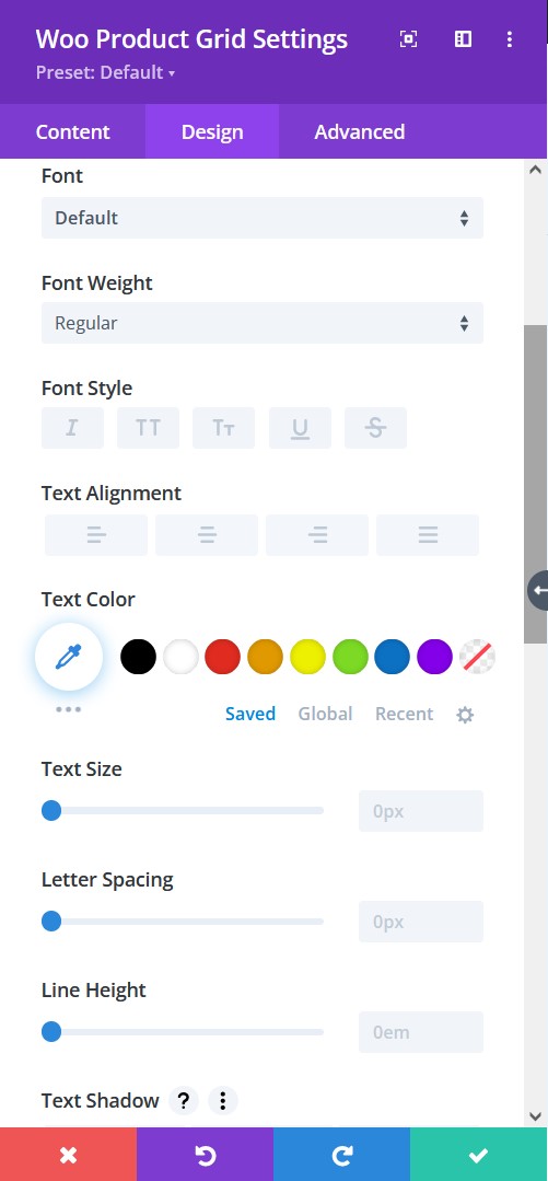
Design tab → Product Text (Category/Price)
- Font – Choose a font. All Google web fonts are available here. You can upload a custom font as well.
- Font Weight – select the weight of the font from Light to Ultra Bold
- Font Style – select a font style from the following
- Text Alignment – align the text to left, right, or center
- Text Color – pick a color for the text
- Text Size – resize the text
- Letter Spacing – Adjust the spacing between the letters of the text
- Line Height – adjust the space between multiple lines added to the design
- Text Shadow – add a shadow to the text
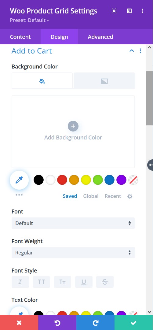
Design tab → Add To Cart
- Background Color – Add a background fill color or gradient for the description text
- Font – Choose a font. All Google web fonts are available here. You can upload a custom font as well.
- Font Weight – select the weight of the font from Light to Ultra Bold
- Font Style – select a font style from
- Text Alignment – align the text to left, right, or center
- Text Color – pick a color for the text
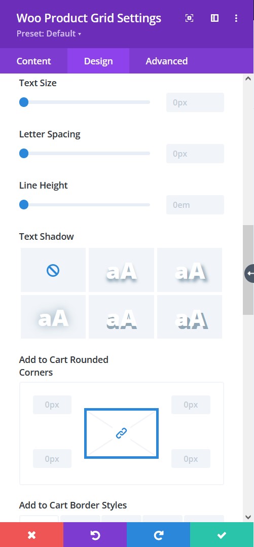
- Text Size – resize the text
- Letter Spacing – Adjust the spacing between the letters of the text
- Line Height – adjust the space between multiple lines added to the design
- Text Shadow – add a shadow to the text
- Text Rounded Corners – include rounded corner by adjusting the four corners
- Border Styles – add a border to any side you like or have borders on all four sides
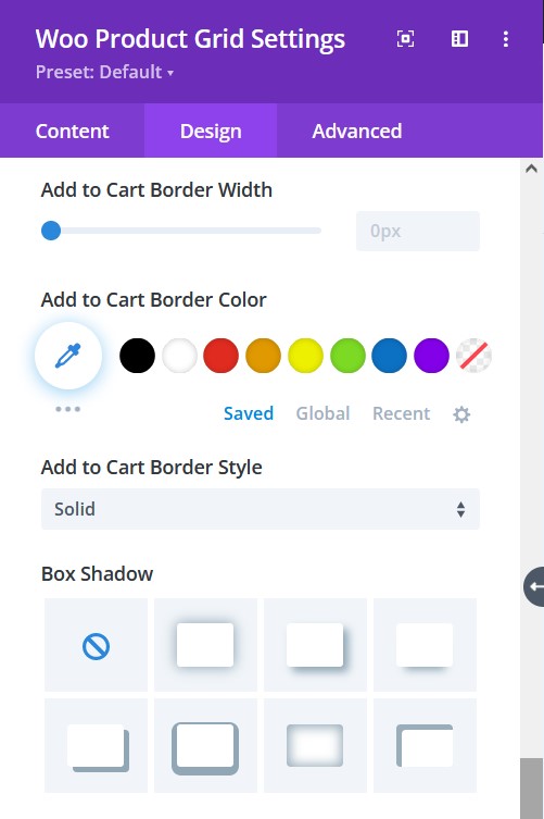
Design tab → Add To Cart
- Border Width – adjust the width of the border
- Border Color – select a color for the border
- Border Style – include a style to the border
- Box-shadow – add a box-shadow to the element
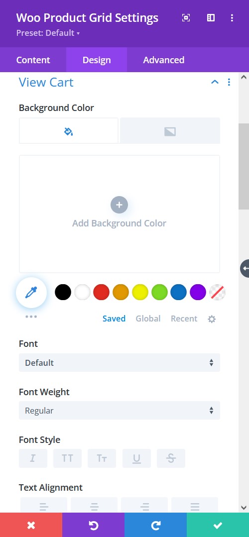
Design tab → View Cart
- Background Color – Add a background fill color or gradient for the description text
- Font – Choose a font. All Google web fonts are available here. You can upload a custom font as well.
- Font Weight – select the weight of the font from Light to Ultra Bold
- Font Style – select a font style from
- Text Alignment – align the text to left, right, or center
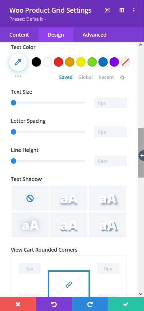
Design tab → View Cart
- Text Color – pick a color for the text
- Text Size – resize the text
- Letter Spacing – Adjust the spacing between the letters of the text
- Line Height – adjust the space between multiple lines added to the design
- Text Shadow – add a shadow to the text
- Rounded Corners – include rounded corner by adjusting the four corners
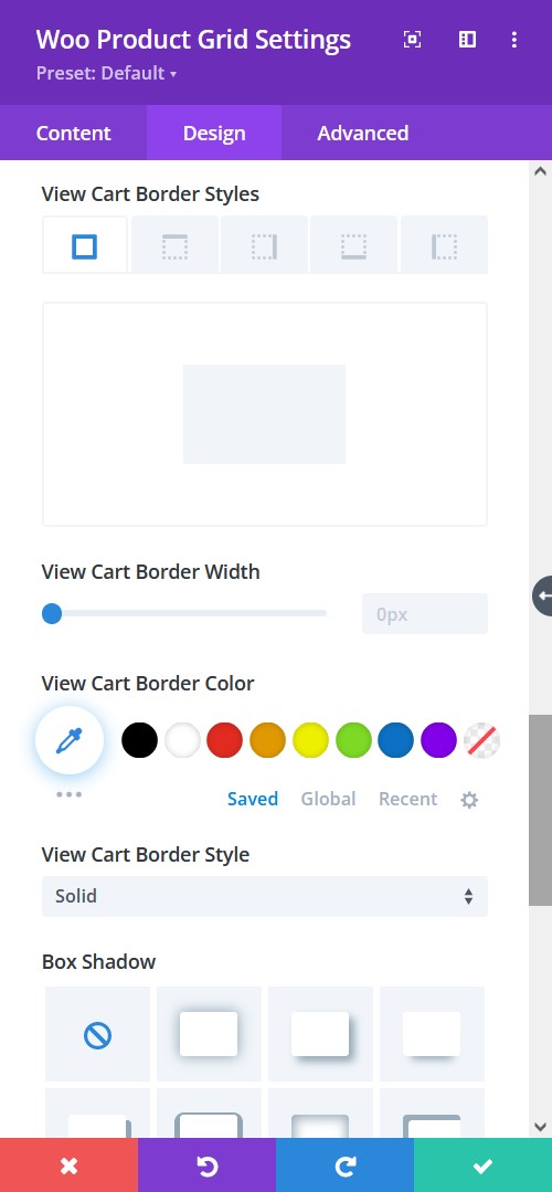
Design tab → View Cart
- Border Styles – add a border to any side you like or have borders on all four sides
- Border Width – adjust the width of the border
- Border Color – select a color for the border
- Border Style – include a style to the border
- Box-shadow – add a box-shadow to the element
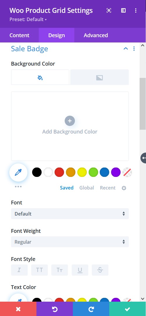
Design tab → Sales Badge
- Background Color – Add a background fill color or gradient for the description text
- Font – Choose a font. All Google web fonts are available here. You can upload a custom font as well.
- Font Weight – select the weight of the font from Light to Ultra Bold
- Font Style – select a font style from
- Text Alignment – align the text to left, right, or center
- Text Color – pick a color for the text
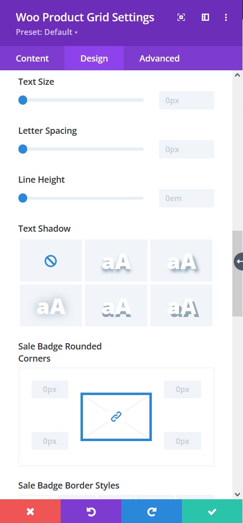
Design tab → Sales Badge
- Text Size – resize the text
- Letter Spacing – Adjust the spacing between the letters of the text
- Line Height – adjust the space between multiple lines added to the design
- Text Shadow – add a shadow to the text
- Rounded Corners – include rounded corner by adjusting the four corners
- Border Styles – add a border to any side you like or have borders on all four sides
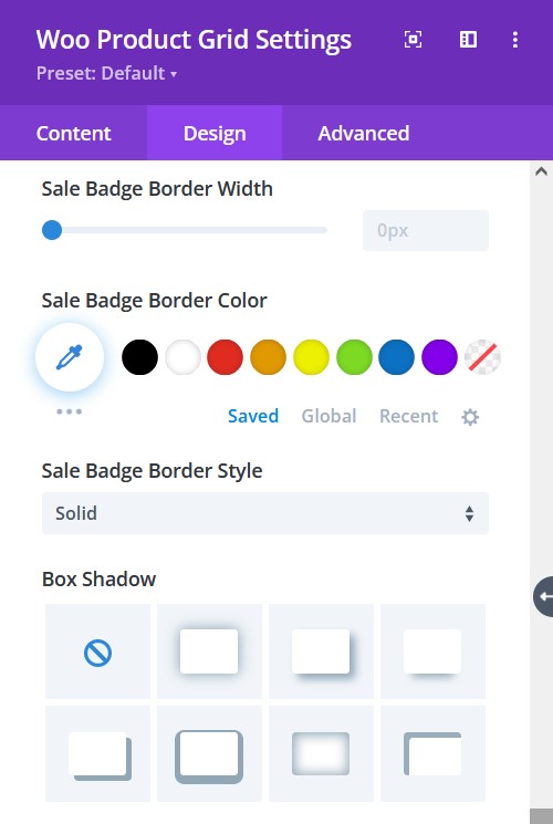
Design tab → Sales Badge
- Border Width – adjust the width of the border
- Border Color – select a color for the border
- Border Style – include a style to the border
- Box-shadow – add a box-shadow to the element
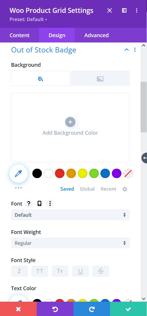
Design tab → Out of Stock Badge
- Background Color – Add a background fill color or gradient for the description text
- Font – Choose a font. All Google web fonts are available here. You can upload a custom font as well.
- Font Weight – select the weight of the font from Light to Ultra Bold
- Font Style – select a font style from
- Text Alignment – align the text to left, right, or center
- Text Color – pick a color for the text
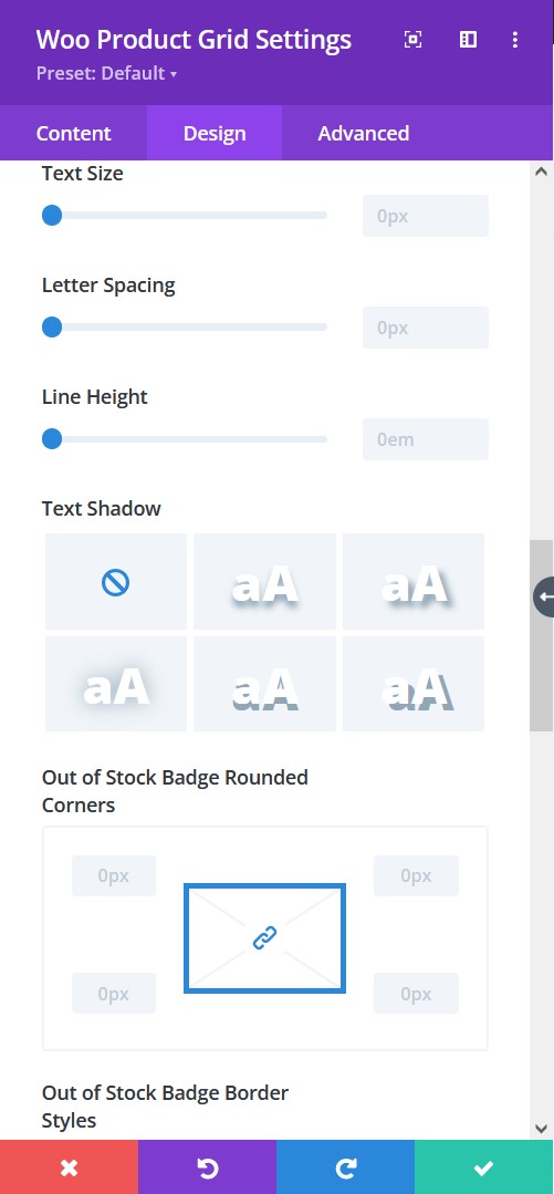
Design tab → Out of Stock Badge
- Text Size – resize the text
- Letter Spacing – Adjust the spacing between the letters of the text
- Line Height – adjust the space between multiple lines added to the design
- Text Shadow – add a shadow to the text
- Rounded Corners – include rounded corner by adjusting the four corners
- Border Styles – add a border to any side you like or have borders on all four sides
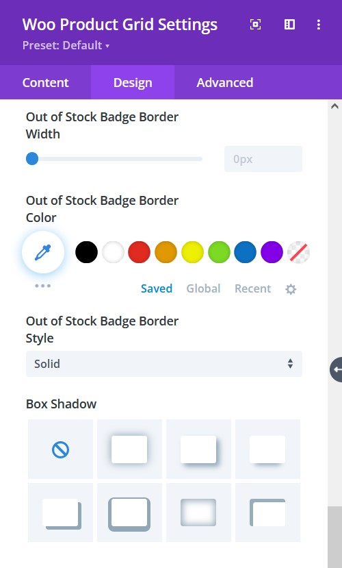
Design tab → Out of Stock Badge
- Border Width – adjust the width of the border
- Border Color – select a color for the border
- Border Style – include a style to the border
- Box-shadow – add a box-shadow to the element
