Customize your products with categorized filters! Multiple filters can help you attract more customers. Each product can be beautifully displayed along with its category and number of items!
Content Tab
To configure the product display settings, use the options available in the Woo Product Filter. These settings allow you to control how products are shown on your website. Simply adjust the settings to match your preferences for an optimized user experience.
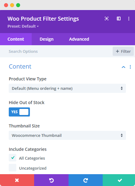
- Product View Type: select product view type from the list of viewing options
- Hide Out of Stock: enable to hide the out of stock products
- Include Category: select the categories that you want the viewers to see; if none is selected, all categories will show
- Product Count: number of products to be viewed
- Product Offset: state the number of products to cut down from the first
- Sorted By: sort the products by either ascending or descending order
- Order By: There are at least 7 ways to order the products, select the one you prefer.
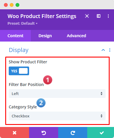
- Show Product Filter: Enable this option to display the selected product filter from the list.
- Filter Bar Position: Adjust the "Filter Bar Position" to "Top," "Right," or "Left."
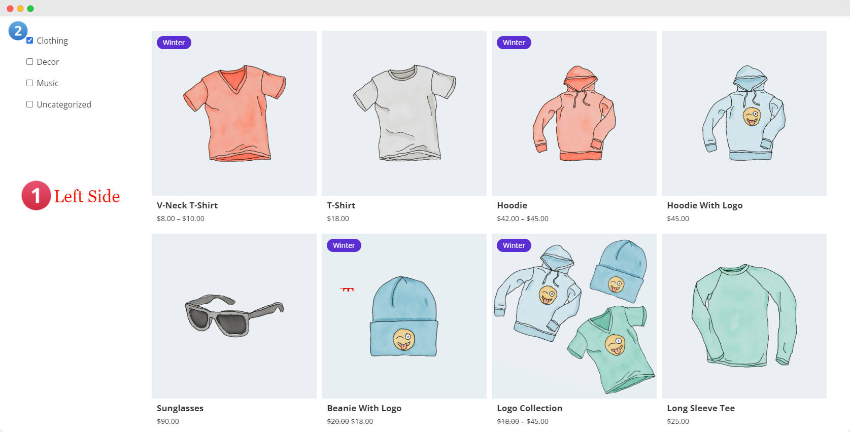
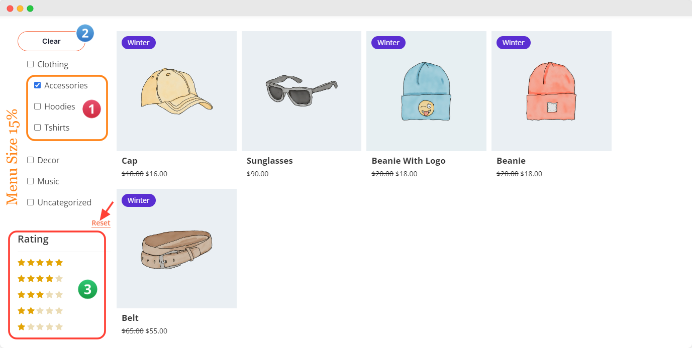
- Category Style: Choose the category display style with options for "List" or "Checkbox." To see the full effect of the "Checkbox" style, set the "Filter Bar Position" to "Left" or "Right."
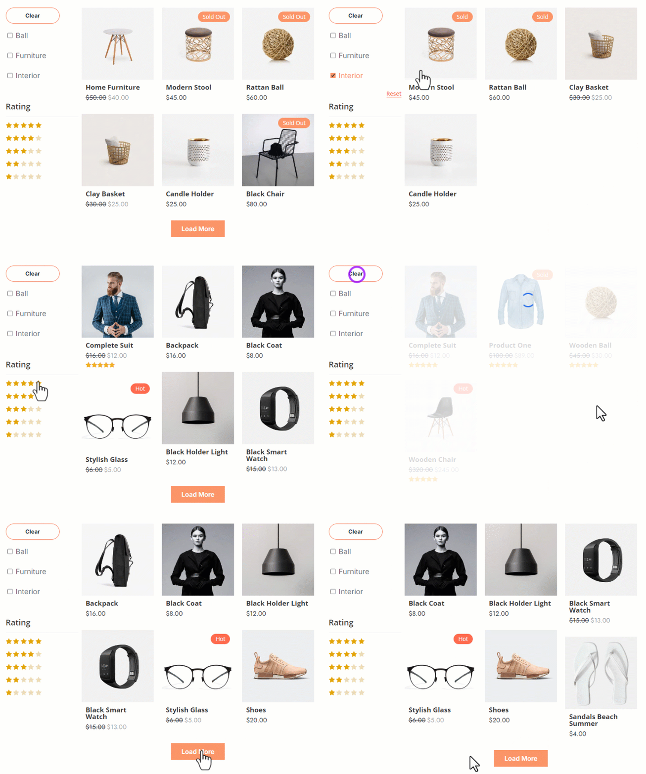
This is how the module layout appears after enabling the above options.
Content Tab → Display
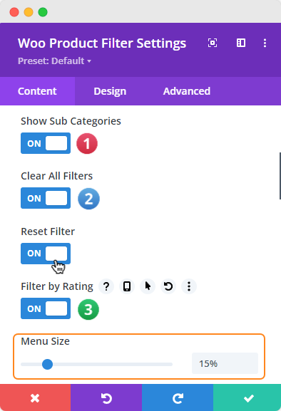
- Show Sub-Categories: Toggle the switch to show or hide sub-categories in the Filter Bar.
- Clear All Filters: Enable this option to allow users to clear all active filters (e.g., Price Range, Rating, Category) on the front end. This option will "Clear/Reset" all applied filters.
- Reset Filter: Display the "Reset" option for individual filters.
- Filter by Rating: Enable filtering options based on user ratings.
- Menu Size: Adjust the length of the filter menu by dragging the progress bar or inputting a specific percentage.
This is how the module layout appears after enabling the above options.
Content Tab → Display
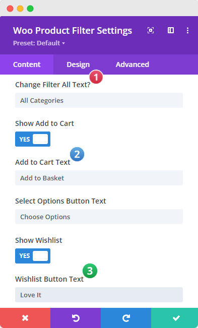
- Show All Text in Filter Menu: Use the "Show/Hide" switcher to display or hide the "All" category in the filter menu. You can customize the "All" text by entering your preferred wording in the field below (Change Filter All Text?). This is especially useful for translating the text into different languages or adding custom text.
- Show Add to Cart: Enable this option to display the "Add to Cart" button.
- Add to Cart Text: Customize the "Add to Cart" button text or translate it into different languages.
- Select Options Button Text: Customize the "Select Options" button text and translate it if needed.
- Show Wishlist: Display or hide the "Wishlist" icon/button.
This is how the module layout appears after enabling the above options.
Content Tab → Display
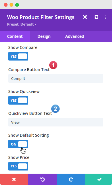
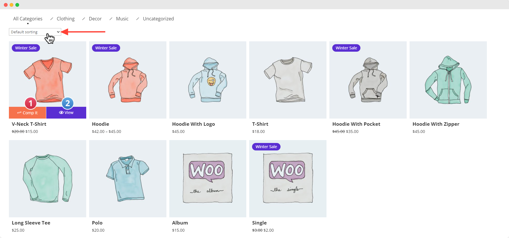
- Show Compare: Display or hide the "Compare" option/button.
- Show QuickView: Display or hide the "Quick View" button.
- QuickView Button Text: Customize or set custom text for the "Quick View" button.
- Show Default Sorting: Enable or disable WooCommerce default sorting options, typically located at the top right corner of the "Product Grid."
- Show Price: Enable this option to display the price of products.
This is how the module layout appears after enabling the above options.
Content Tab → Display
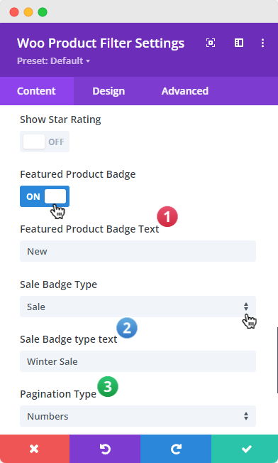
- Show Star Rating: Enable this option to display star ratings on products.
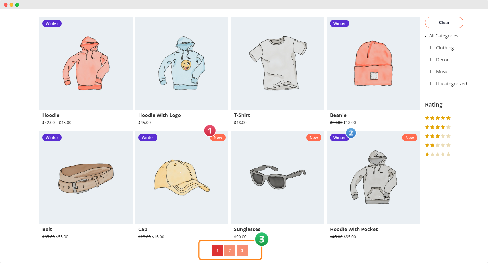
- Featured Product Badge: Enable or disable the "Featured" badge.
- Featured Product Badge Text: Customize the text for the Featured badge, e.g., "Hot," "New," "Updated," "Upcoming," or "Best Selling."
- Sale Badge Type: Choose from three options in the dropdown menu (None, Sale, Percentage). Each option provides a separate field for entering a value, such as "Summer," "Winter," "Christmas," "Halloween," or "Year-End."
- Pagination Type: Select the "Pagination Styles," like "Numbers" or "Load More." You can also customize the "Load More" button text.
- Show Out of Stock Badge: Enable this option to display an "Out of Stock" badge on products.
This is how the module layout appears after enabling the above options.
Design Tab
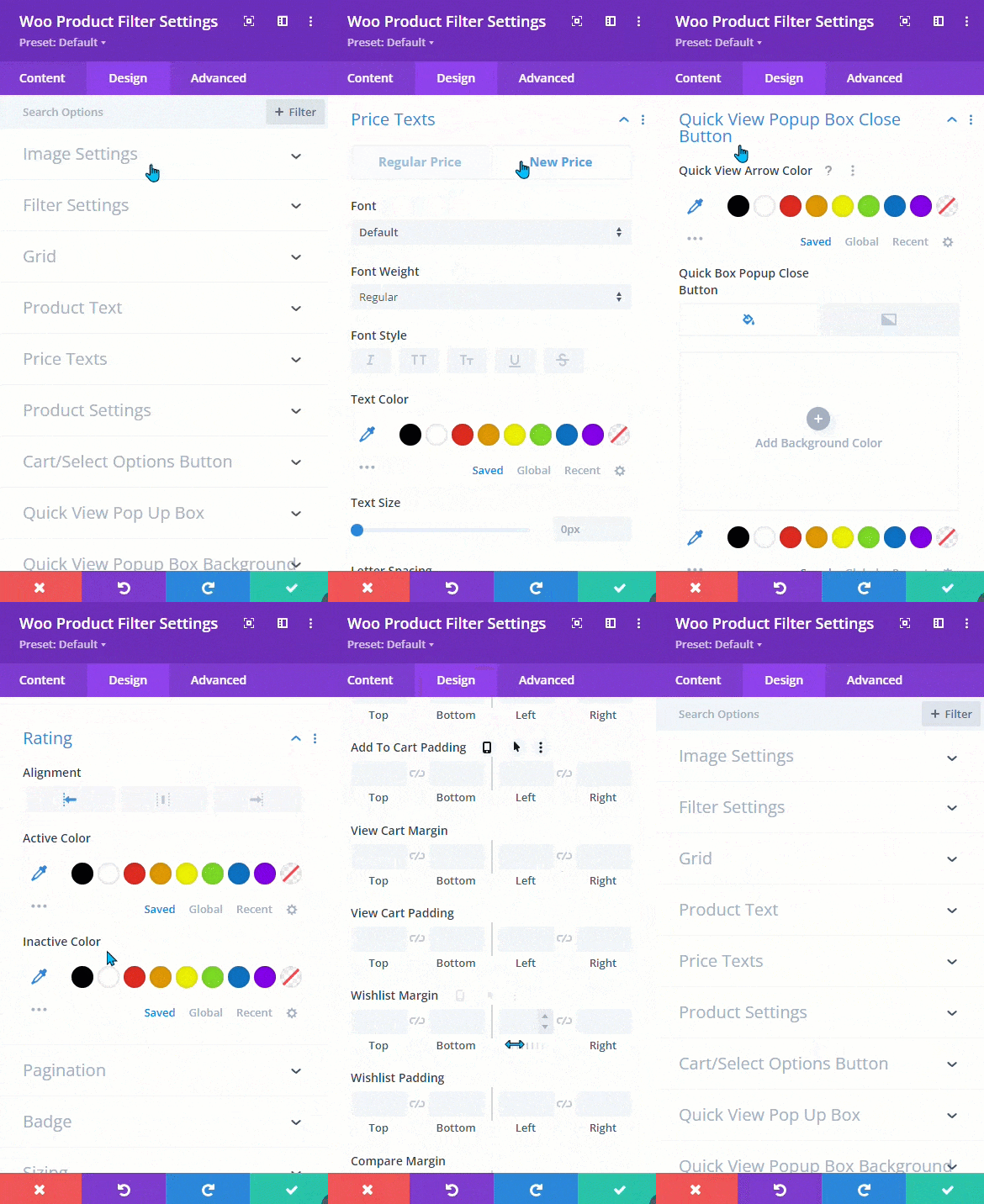
To access all the customization options, head to the Design Tab. There, you'll discover a wide range of settings that provide complete control over every aspect of the filter module.
You can adjust fonts, colors, borders, shadows, and more to personalize your layout. The options are organized for easy reference, making it simple to fine-tune each detail and create a unique design.
-
Image Settings
-
Filter Settings (Category & Background)
-
Grid
-
Product Text
-
Price Text
-
Product Settings
-
Cart/Select Options Button (Add to Cart & View Cart)
-
Quick View Popup Box (Title, Desc, Price, Button, Meta)
-
Quick View Popup Box Background
-
Quick View Popup Box Arrow
-
Quick View Popup Box Close Button
-
Wishlist Button
-
Compare Button
-
Quick View Button
-
Filter Rating
-
Pagination
-
Badge
-
Sizing
-
Spacing
-
Box Shadow
Important Note: Please note that while all customization settings in the "Content & Design" tab will be accurately displayed on the front end of your website, they may not always appear as expected in the Visual Builder. To ensure that the changes are applied correctly, always preview your site on the front end after making adjustments.
