Woo Product Accordion
Present products in a unique way with the Woo Product Accordion!
There are options to include products with their own categories and count. Display the products on hover or on click, accompanied by a lovely animation.
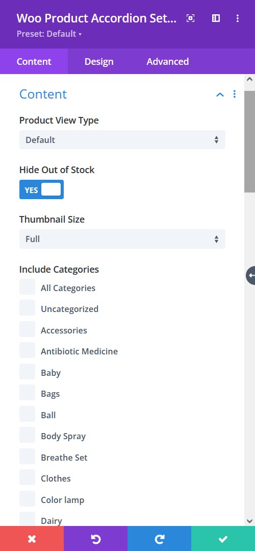
Content tab → Content
- Product View Type: Select a product view type from default, latest products, best selling, and all the way to product category. These will help you define how you want the products viewed.
- Hide Out Of Stock Products – hide or let view the out of stock products
- Thumbnail Size – pick a size for the image thumbnail
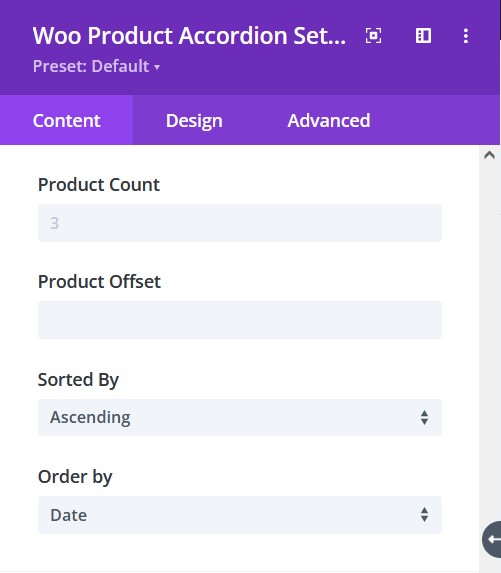
Content tab → Content
- Product Count – enable to show product count
- Product Offset – pick a number for how many products you want to omit from the first
- Sorted by – choose how you want the products to be sorted
- Order By – There are at least 7 ways to order the products, select the one you prefer
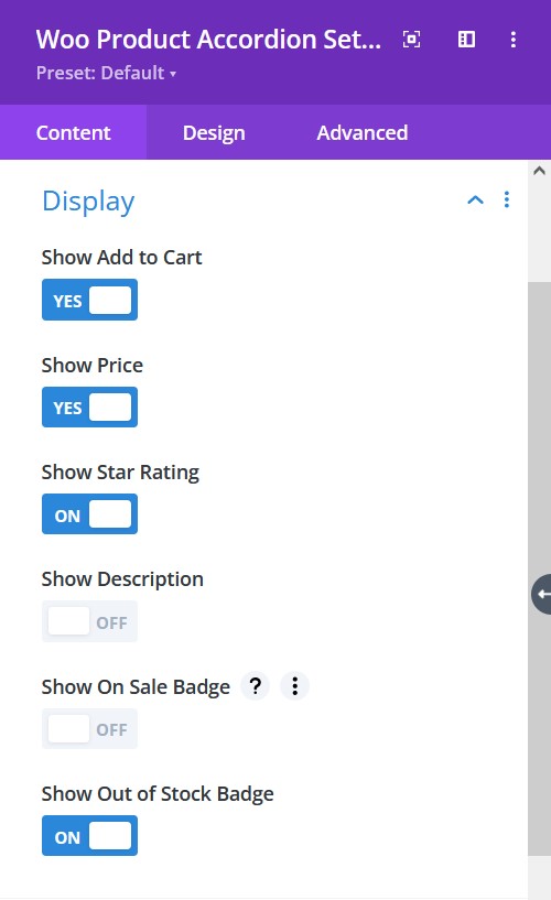
Content tab → Display
- Show Add To Cart – enable to show add to cart
- Show Price – enable to show the price of a product
- Show Star Rating – enable to show the star rating
- Show Description – choose to show description text
- Show On Sale Badge – enable to show On Sale Badge
- Show Out of Stock Badge – enable to show the Out of Stock Badge
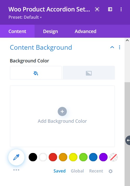
Content tab → Content Background
- Background color – select background fill color or gradient for the content.
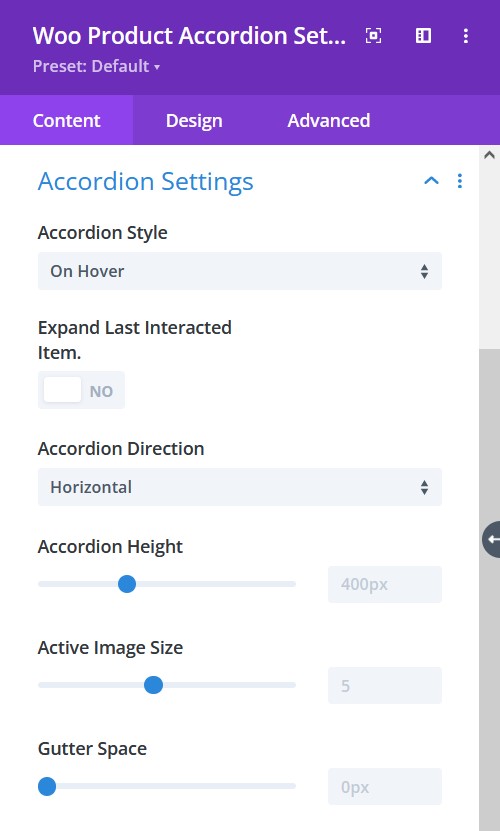
Content tab → Accordion Settings
- Accordion Style – choose the style of accordion
- Expand Last Interacted Item – choose to keep the last interacted item active
- Accordion Direction – select the direction of the accordion to be in
- Accordion Height – adjust the accordion height
- Active Image Size – adjust active image size separately
- Gutter Space – adjust the gutter space using the slider
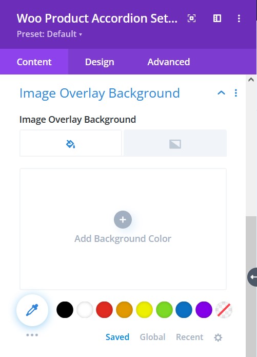
Content tab → Image Overlay Background
- Image Overlay Background – Add an overlay background fill color or gradient on top of the image
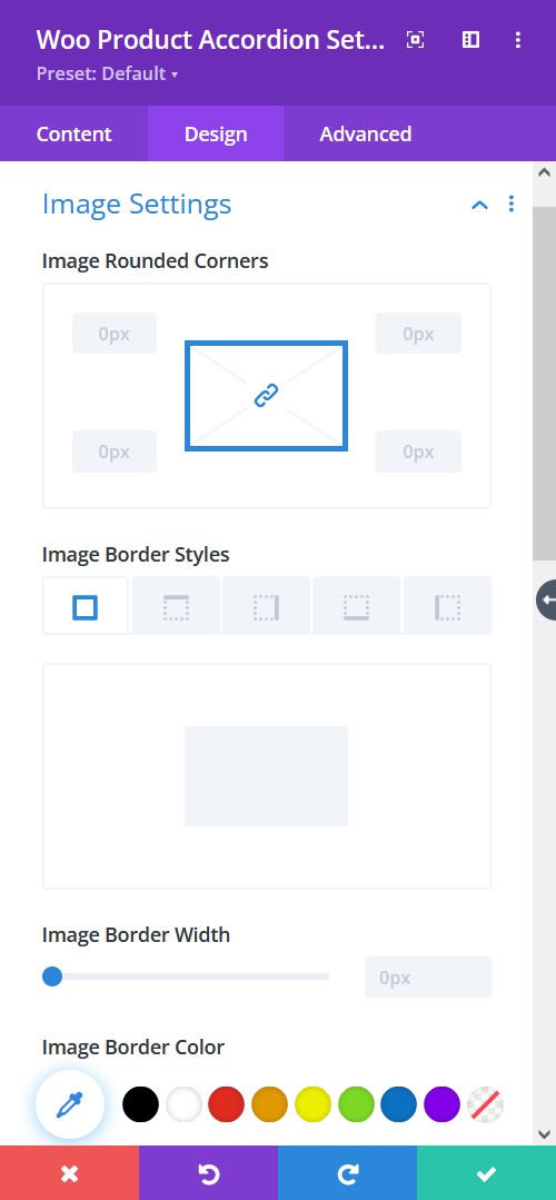
Design tab → Image Settings
- Image Rounded Corners – include rounded corner by adjusting the four corners
- Image Border Styles – add a border to any side you like or have borders on all four sides
- Image Border Width – adjust the width of the border
- Image Border Color – select a color for the border
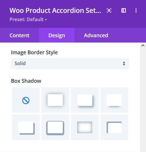
Design tab → Image Settings
- Image Border Style – include a style to the border
- Box-shadow – add a box-shadow to the element
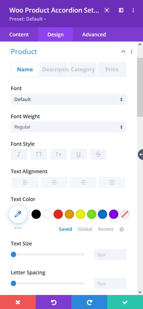
Design tab → Product
- Font – Choose a font. All Google web fonts are available here. You can upload a custom font as well.
- Font Weight – select the weight of the font from Light to Ultra Bold
- Font Style – select a font style from
- Text Alignment – align the text to left, right, or center
- Text Color – pick a color for the text
- Text Size – resize the text
- Letter Spacing – Adjust the spacing between the letters of the text
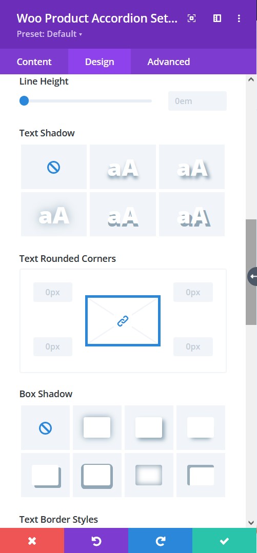
Design tab → Product
- Line Height – adjust the space between multiple lines added to the design
- Text Shadow – add a shadow to the text
- Text Rounded Corners – include rounded corner by adjusting the four corners
- Box-shadow – add a box-shadow to the element
- Border Styles – add a border to any side you like or have borders on all four sides
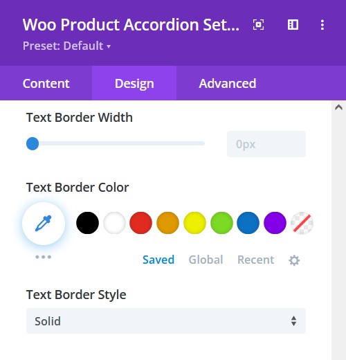
Design tab → Product
- Border Width – adjust the width of the border
- Text Border Color – select a color for the border
- Text Border Style – include a style to the border
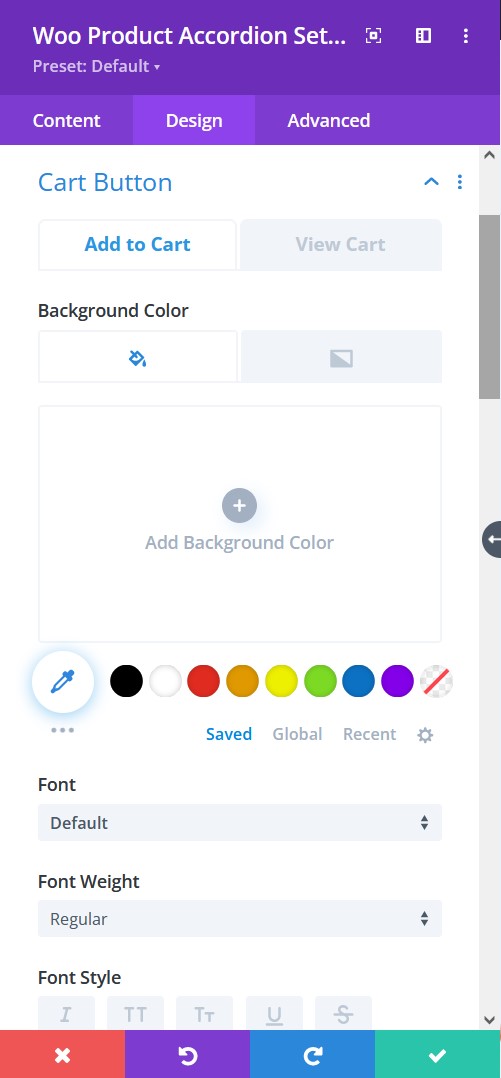
Design tab → Cart Button
- Background Color – Add a background fill color or gradient for the description text
- Font – Choose a font. All Google web fonts are available here. You can upload a custom font as well.
- Font Weight – select the weight of the font from Light to Ultra Bold
- Font Style – select a font style
Design tab → Cart Button
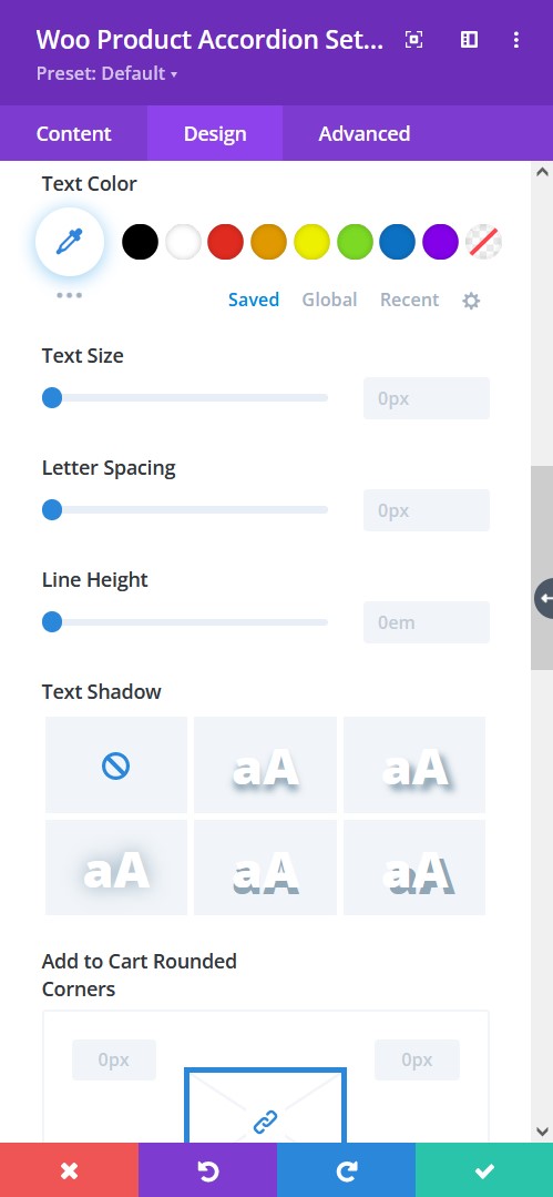
- Text Color – pick a color for the text
- Text Size – resize the text
- Letter Spacing – Adjust the spacing between the letters of the text
- Line Height – adjust the space between multiple lines added to the design
- Text Shadow – add a shadow to the text
- Text Rounded Corners – include rounded corner by adjusting the four corners
Design tab → Cart Button
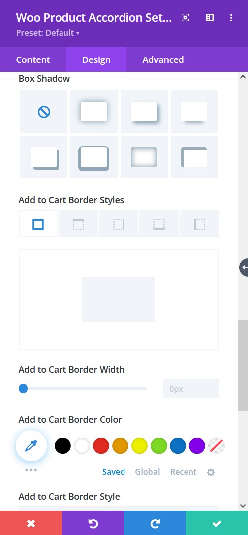
- Box-shadow – add a box-shadow to the element
- Border Styles – add a border to any side you like or have borders on all four sides
- Border Width – adjust the width of the border
- Border Color – select a color for the border
- Border Style – include a style to the border
Design tab → Badge
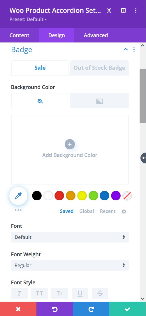
- Background Color – Add a background fill color or gradient for the sale badge
- Font – Choose a font. All Google web fonts are available here. You can upload a custom font as well.
- Font Weight – select the weight of the font from Light to Ultra Bold
- Font Style – select a font style

Design tab → Badge
- Text Color – pick a color for the text
- Text Size – resize the text
- Letter Spacing – Adjust the spacing between the letters of the text
- Line Height – adjust the space between multiple lines added to the design
- Text Shadow – add a shadow to the text
- Text Rounded Corners – include rounded corner by adjusting the four corners
Design tab → Badge
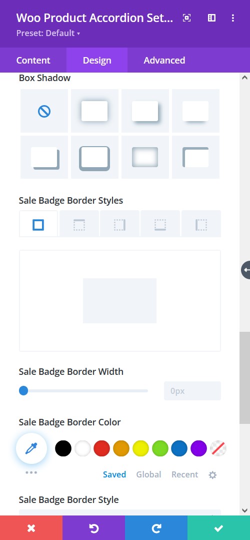
- Box-shadow – add a box-shadow to the element
- Border Styles – add a border to any side you like or have borders on all four sides
- Border Width – adjust the width of the border
- Border Color – select a color for the border
- Border Style – include a style to the border
