An elegant category carousel slider that allows you to categorize based on brands, products, sponsors, and many more.
Within the Woo Category Carousel, some powerful features allow you to control everything. Create categorized blog posts concerning the products in an unlimited number.
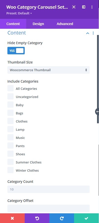
Content tab → Content
- Hide Empty Category - enable this to hide empty categories from the loop.
- Thumbnail Size - specify the size of the category image.
- Include Categories - select category. If no category is selected, products from all categories will be displayed.
- Category Count - define the number of categories that should be displayed per page
- Category Offset - define the number of categories that should be cut down from the first.
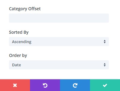
Content tab → Content
- Sorted By - choose how your posts should be sorted.
- Order By - here you can specify the order in which the products should be displayed.
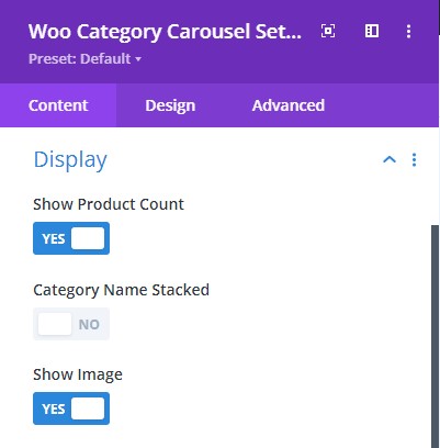
Content tab → Display
- Show Product Count - enable to show product count
- Category Name Stacked - enable to show product count at the bottom of the product category name
- Show Image - enable to show the image
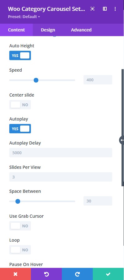
Content → Carousel Settings
- Auto Height - allows the images to be resized automatically by adjusting their height.
- Autoplay - enable the autoplay feature.
- Autoplay Delay - adjust the autoplay delay using the slider below.
- Loop - enable to have the slider slide continuously in a loop.
- Center Slide - enable this to have the active image centered.
- Speed - adjust the speed of the carousel using the slider below (higher the value, the slider will go slowly and lower the value, the slider will go faster)
- Space Between - adjust the space between the images
- Slides Per View - Place the number of slides you want to view
- Pause on Hover - enable this to have the slider pause when the cursor hovers on top
- Use Grab Cursor - a hand tool will show to manually move the slide
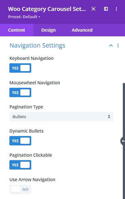
Content → Navigation Settings
- Keyboard Navigation - enable to have keyboard navigation
- Mousewheel Navigation - enable this to navigate using the mouse wheel
- Pagination Type - select types for the slider like a bullet, fraction, or progress bar
- Dynamic Bullets - enable to highlight the bullet for the active image
- Pagination Clickable - make the pagination type clickable
- Use Arrow Navigation - select on or off to control the slide using arrows
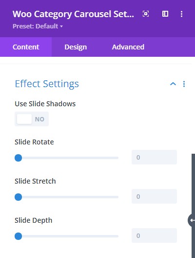
Content tab → Effect Settings
- Use Slide Shadows - when enabled, it adds a shadow filter to the back of the image
- Slide Rotate - adjust the slider to add a rotation effect to the carousel
- Slide Stretch - adjust the slider to include the slide stretch effect
- Slide Depth - adjust the gap between the images from the center to the surface to the bottom of the slider
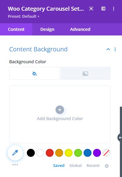
Content → Content Background
- Background color - select background fill color or gradient for the content.
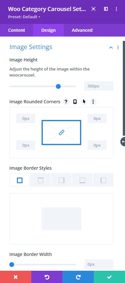
Design tab → Image Settings
- Image Height - adjust the height of the image within the slider
- Image Rounded Corners - include rounded corner by adjusting the four corners
- Border Styles - add a border to any side you like or have borders on all four sides
- Border Width - adjust the width of the border
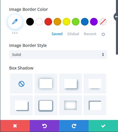
Design tab → Image Settings
- Image Border Color - select a color for the border
- Image Border Style - include a style to the border
- Box-shadow - add a box-show to the element
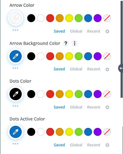
Design tab → Arrow & Dot Color
- Arrow Color - Choose a color for the Arrows
- Arrow Background Color - Choose a background color for the Arrows
- Dots Color - Select a color for the Dots
- Dots Active Color - Select a color for the Active Dot
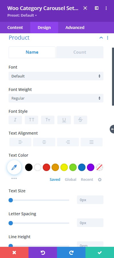
Design tab → Product Name and Product Count
- Font - Choose a font. All Google web fonts are available here. You can upload a custom font as well.
- Font Weight - select the weight of the font from Light to Ultra Bold
- Font Style - select a font style from the following
- Text Alignment - align the text to left, right, or center
- Text Color - pick a color for the text
- Text Size - resize the text
- Letter Spacing - Adjust the spacing between the letters of the text
- Line Height - adjust the space between multiple lines added to the design
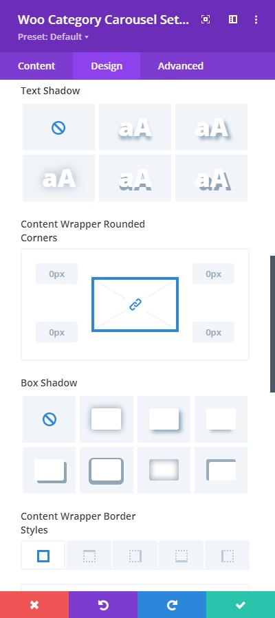
Design tab → Product Name and Product Count
- Text Shadow - add a shadow to the text
- Text Rounded Corners - include rounded corner by adjusting the four corners
- Border Styles - add a border to any side you like or have borders on all four sides
- Border Width - adjust the width of the border
- Text Border Color - select a color for the border
- Text Border Style - include a style to the border
- Box-shadow - add a box-show to the element
- Content Wrapper Border Styles - add a border to any side of the content or have borders on all four sides
Design tab → Product Name and Product Count
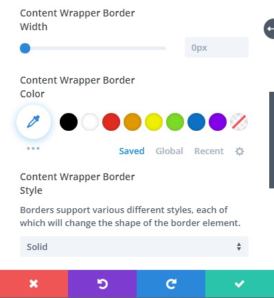
- Content Wrapper Border Width - adjust the width of the border
- Content Wrapper Border Color - select a color for the border
- Content Wrapper Border Style - include a style to the border
