Woo Product Carousel
An exquisite carousel slider product allows you to promote brands, products, sponsors, and many more.
This product is an elegant carousel slider with six impressive layouts.
Within the Woo Carousel product, some impressive features allow you to control everything. Create blog posts concerning the products in an unlimited number.
Great For Marketing Products
The wait is finally over. Unlike any other carousel product, Woo Carousel is as powerful and intuitive as possible. Create stunning designs to market products in the best way with advanced options and incredible design choices.
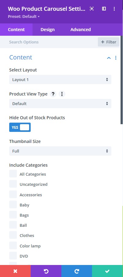
Content tab → Content
- Select Layout – pick from the six trendy layouts
- Product View Type: Select a product view type from default, latest products, best selling, and all the way to product category. These will help you define how you want the products viewed.
- Hide Out Of Stock Products – hide or let view the out of stock products
- Product Count – number of products to be viewed
- Sorted By – sort the products by either ascending or descending order
- Order By – There are at least 7 ways to order the products, select the one you prefer.
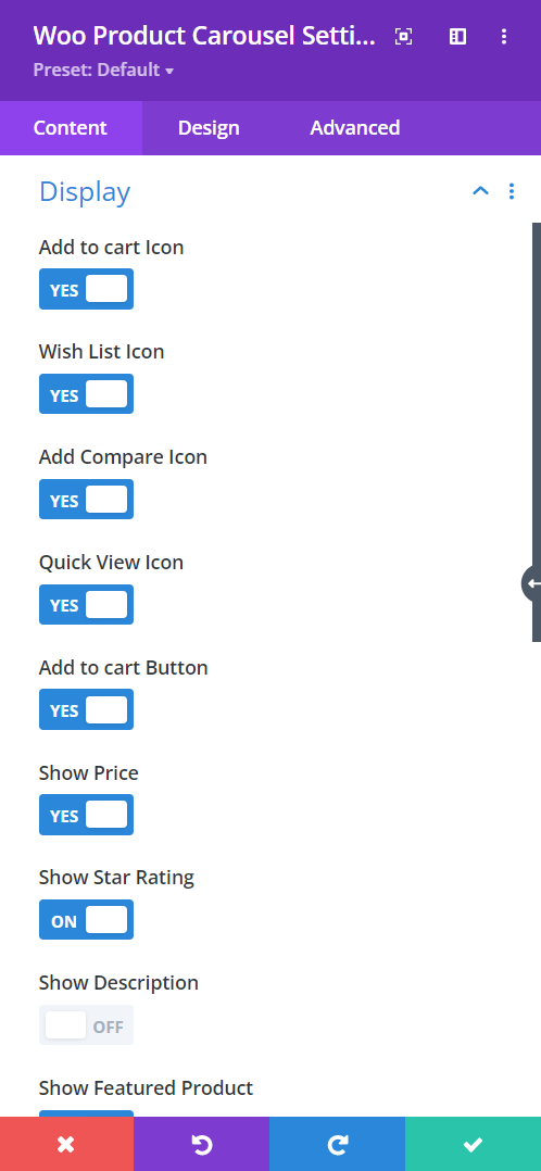
Content tab → Display
- Add To Cart Icon – enable to show the add to cart icon
- Wish List Icon – enable the switch to have visitors view their Wishlist
- Add Compare Icon – enable the switch to include the compare icon to your product carousel design
- Quick View Icon –
- Price – enable to show the price of a product
- Star Rating – enable to show the star rating
- Show Description – enable to show the description text
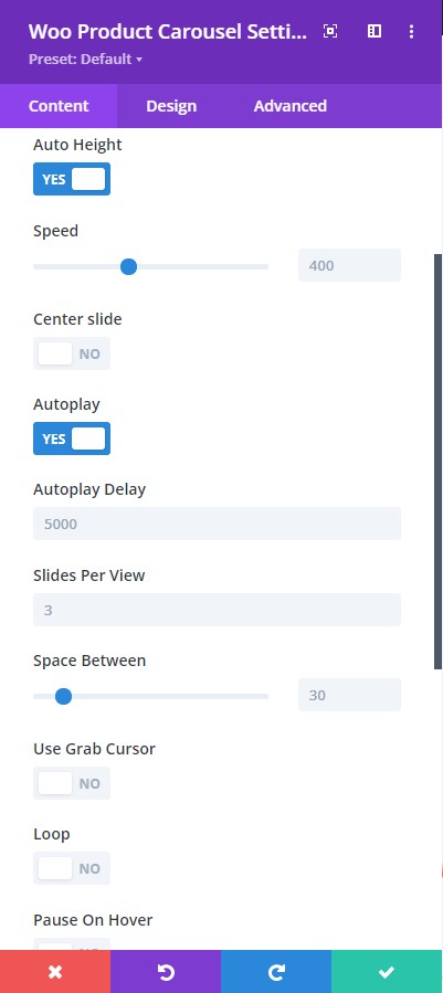
Content → Carousel Settings
- Auto Height – allows the images to be resized automatically by adjusting their height.
- Autoplay – enable the autoplay feature.
- Autoplay Delay – adjust the autoplay delay using the slider below.
- Loop – enable to have the slider slide continuously in a loop.
- Center Slide – enable this to have the active image centered.
- Speed – adjust the speed of the carousel using the slider below (higher the value, the slider will go slowly and lower the value, the slider will go faster)
- Space Between – adjust the space between the images
- Slides Per View – Place the number of slides you want to view
- Pause on Hover – enable this to have the slider pause when the cursor hovers on top
- Use Grab Cursor – a hand tool will show to manually move the slide
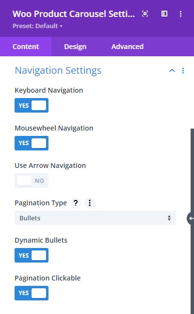
Content → Navigation Settings
- Keyboard Navigation – enable to have keyboard navigation
- Mousewheel Navigation – enable this to navigate using the mouse wheel
- Use Arrow Navigation – select on or off to control the slide using arrows
- Dynamic Bullets – enable to highlight the bullet for the active image
- Pagination Type – select types for the slider like a bullet, fraction, or progress bar
- Pagination Clickable – make the pagination type clickable
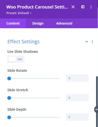
Content tab → Effect Settings
- Use Slide Shadows – enable this to add a shadow surrounding the products as they slide
- Slide Rotate – add a rotation effect to the products as they slide
- Slide Stretch – adjust the slide stretch to bring the products closer
- Slide Depth – adjust the gap between products and highlight the centered product. This helps showcase the images from the center to the surface to the bottom of the slider.
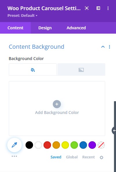
Content → Content Background
- Background color – select background fill color or gradient for the content.
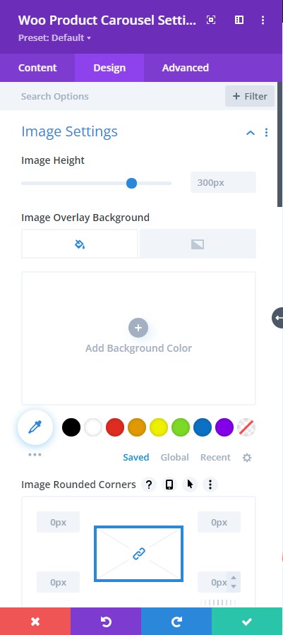
Design tab → Image Settings
- Image Height – adjust the height of the images
- Image Overlay Background – Add an overlay background fill color or gradient on top of the image
- Image Rounded Corners – include rounded corner by adjusting the four corner
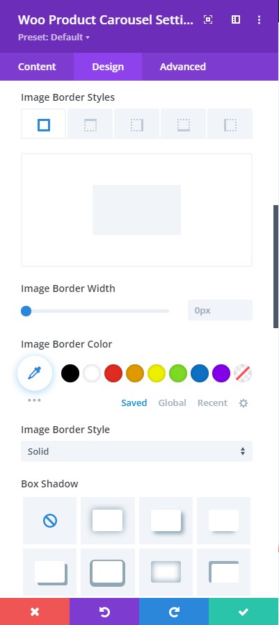
Design tab → Image Settings
- Image Border Styles – add a border to any side you like or have borders on all four sides
- Image Border Width – adjust the width of the border
- Image Border Color – select a color for the border
- Image Border Style – include a style to the border
- Box-shadow – add a box-shadow to the element
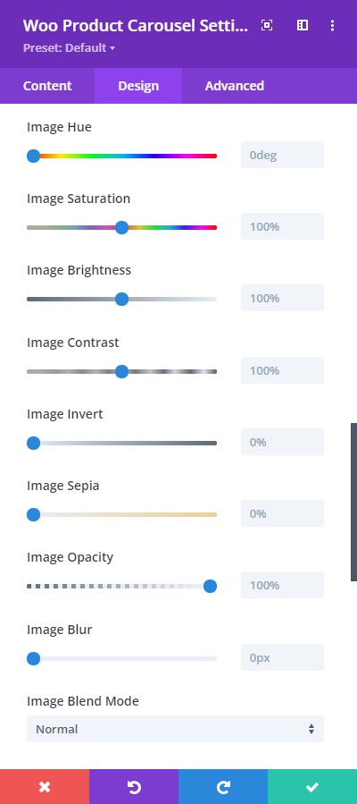
Design tab → Image Settings
- Image Hue – adjust image hue using the slider
- Image Saturation – adjust the intensity of the image
- Image Brightness – configure the brightness of the image
- Image Contrast – include contrast to the image
- Image Invert – use this to shift to an inverted image
- Image Sepia – adjust to apply sepia color tone to the image
- Image Opacity – adjust the opacity of the image
- Image Blur – add blur to the image
- Image Blend Mode – Select from the 16 types of image blend mode for a quick configuration
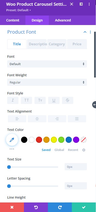
Design tab → Product Font (Title, Description, Category, Price)
- Font – Choose a font. All Google web fonts are available here. You can upload a custom font as well.
- Font Weight – select the weight of the font from Light to Ultra Bold
- Font Style – select a font style from
- Font Style – stylize the font
- Text Alignment – align the text to left, right, or center
- Text Color – pick a text color
- Text Size – resize the text as needed
- Letter Spacing – Adjust the spacing between the letters of the text
- Line Height – adjust the space between multiple lines added to the design
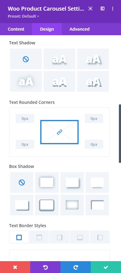
Design tab → Product Font (Title, Description, Category, Price)
- Text Shadow – add a shadow to the text
- Text Rounded Corners – include rounded corner by adjusting the four corners
- Box-shadow – add a box-shadow to the element
- Text Border Styles – add a border to any side you like or have borders on all four sides
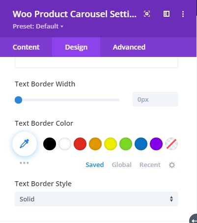
Design tab → Product Font (Title, Description, Category, Price)
- Text Border Width – adjust the width of the border
- Text Border Color – select a color for the border
- Text Border Style – include a style to the border
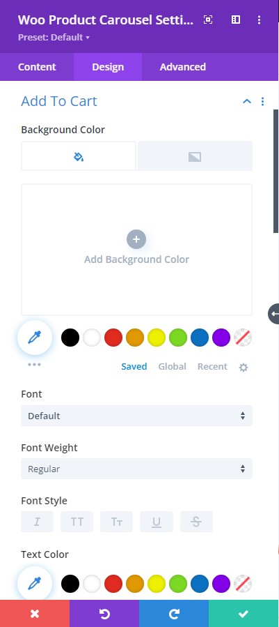
Design tab → Add To Cart
- Background Color – Add a background fill color or gradient for the description text
- Font – Choose a font. All Google web fonts are available here. You can upload a custom font as well.
- Font Weight – select the weight of the font from Light to Ultra Bold
- Font Style – select a font style from
- Text Alignment – align the text to left, right, or center
- Text Color – pick a color for the text
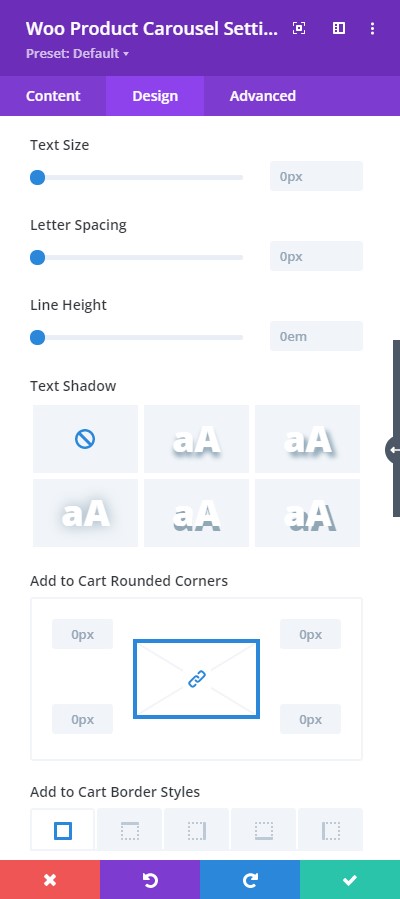
Design tab → Add To Cart
- Text Size – resize the text
- Letter Spacing – Adjust the spacing between the letters of the text
- Line Height – adjust the space between multiple lines added to the design
- Text Shadow – add a shadow to the text
- Add to Cart Rounded Corners – include rounded corner by adjusting the four corners
- Add to Cart Border Styles – include rounded corner by adjusting the four corners
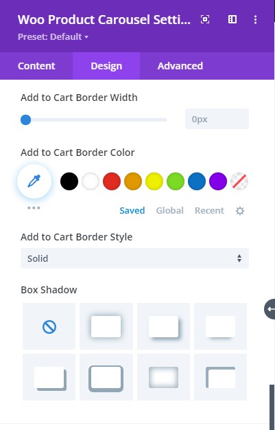
Design tab → Add To Cart
- Add to Cart Border Width – adjust the width of the border
- Add to Cart Border Color – select a color for the border
- Add to Cart Border Style – include a style to the border
- Box-shadow – add a box-shadow to the element
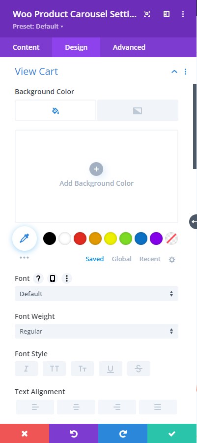
Design tab → View Cart
- Background Color – Add an overlay background fill color or gradient for the view cart icon
- Font – Choose a font. All Google web fonts are available here. You can upload a custom font as well.
- Font Weight – select the weight of the font from Light to Ultra Bold
- Font Style – select a font style from
- Text Alignment – align the text to left, right, or center
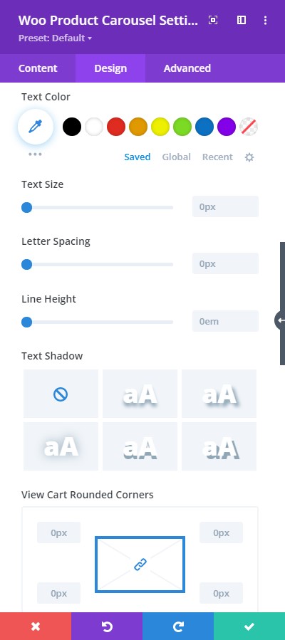
Design tab → View Cart
- Text Color – pick a color for the text
- Text Size – resize the text
- Letter Spacing – Adjust the spacing between the letters of the text
- Line Height – adjust the space between multiple lines added to the design
- Text Shadow – add a shadow to the text
- View Cart Rounded Corners – include rounded corner by adjusting the four corners
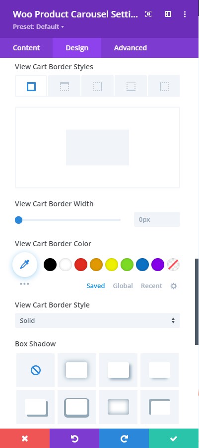
Design tab → View Cart
- View Cart Border Styles – add a border to any side you like or have borders on all four sides
- View Cart Border Width – adjust the width of the border
- View Cart Border Color – select a color for the border
- View Cart Border Style – include a style to the border
- Box-shadow – add a box-shadow to the element
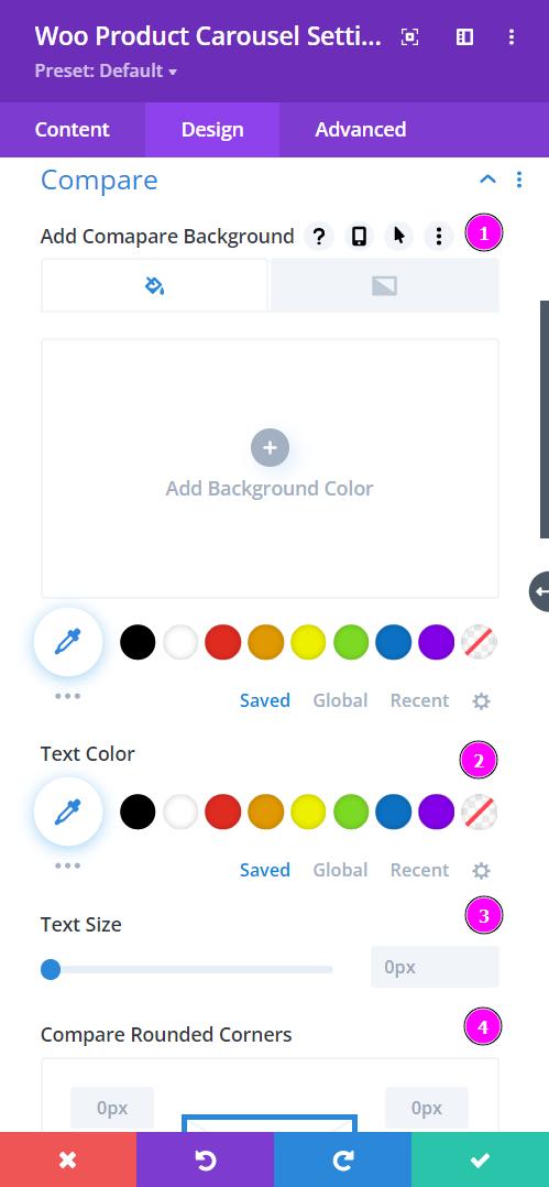
Design → Compare
- Add Compare Background – add color to the background of the compare button
- Text Color – choose a color for the text for the compare button
- Text Size – resize the text for compare button
- Compare Rounded Corners – include rounded corners to the compare button
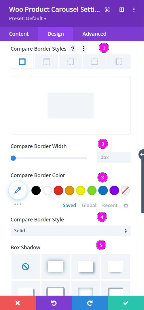
Design → Compare (continued)
- Border Styles – add a border to any side you like or have edges on all four sides
- Border Width – adjust the width of the border
- Border Color – choose a color for the border
- Border Style – include a style to the border
- Box-shadow – add a box shadow to the element
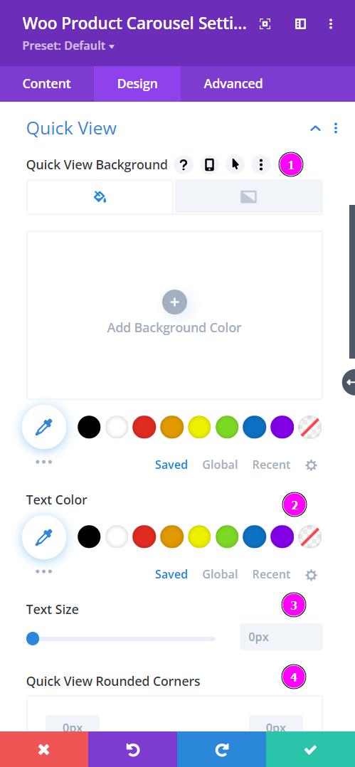
Design → Quick View
- Quick View Background – add color to the background of the quick view button
- Text Color – choose a color for the text for the quick view button
- Text Size – resize the text for quick view button
- Quick View Rounded Corners – include rounded corners to the quick view button
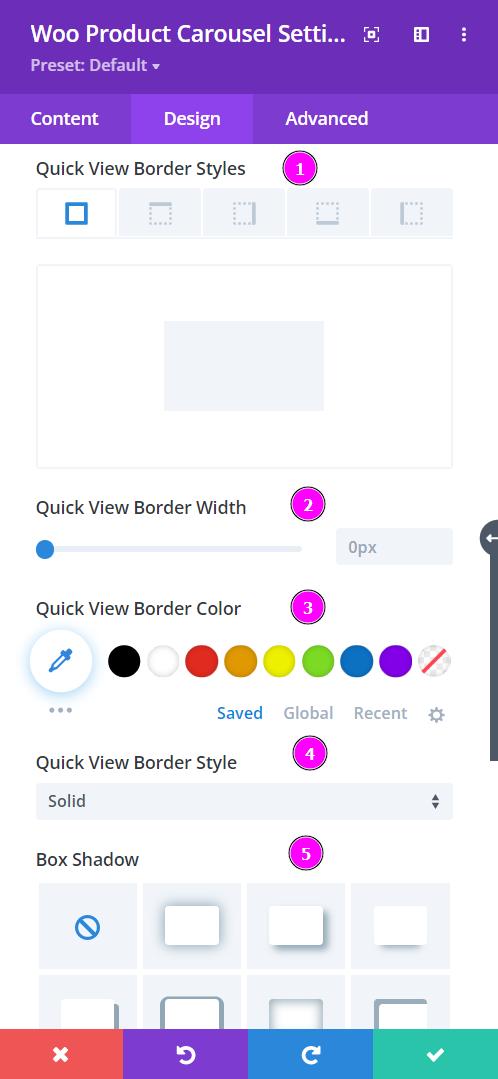
Design → Quick View (continued)
- Border Styles – add a border to any side you like or have edges on all four sides
- Border Width – adjust the width of the border
- Border Color – choose a color for the border
- Border Style – include a style to the border
- Box-shadow – add a box shadow to the element
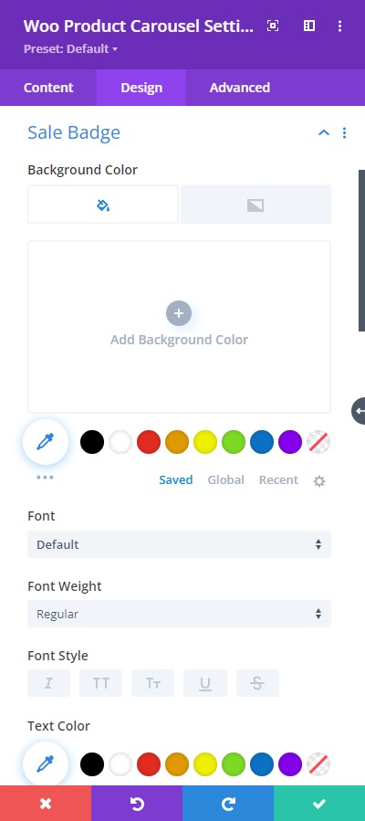
Design tab → Sale Badge
Within the Content tab, you can include any relevant text to put on the sale badge. This feature is visible within Display.
- Background Color – Add a background fill color or gradient for the sale badge
- Font – Choose a font. All Google web fonts are available here, and you can also upload a custom font.
- Font Weight – select the weight of the font from Light to Ultra Bold
- Font Style – choose a font style from
- Text Alignment – align the text to the left, right, or center
- Text Color – pick a color for the text
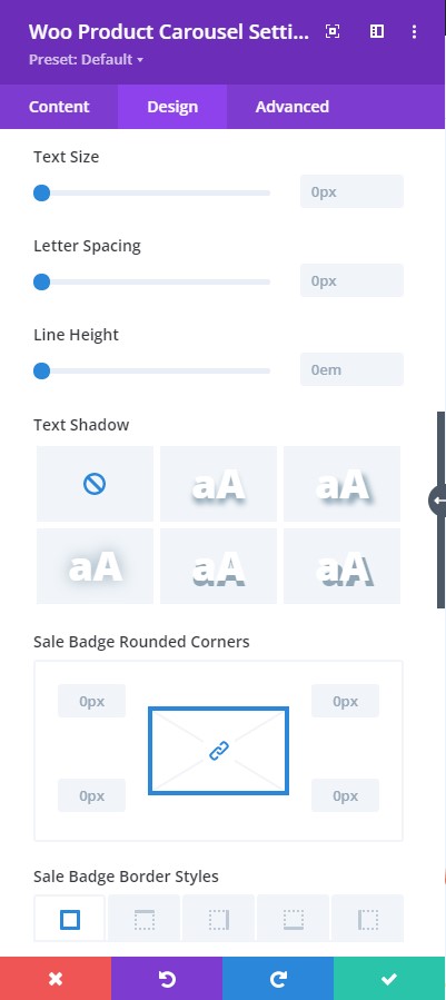
Design tab → Sale Badge
- Text Size – resize the text
- Letter Spacing – Adjust the spacing between the letters of the text
- Line Height – adjust the space between multiple lines added to the design
- Text Shadow – add a shadow to the text
- Sale Badge Rounded Corners – include rounded corner by adjusting the four corners
- Sale Badge Border Styles – add a border to any side you like or have borders on all four sides
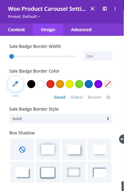
Design tab → Sale Badge
- Sale Badge Border Width – adjust the width of the border
- Sale Badge Border Color – select a color for the border
- Sale Badge Border Style – include a style to the border
- Box-shadow – add a box-shadow to the element
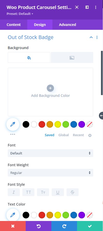
Design tab → Out Of Stock Badge
- Background Color – Add a background fill color or gradient for the out-of-stock badge
- Font – Choose a font. All Google web fonts are available here. You can upload a custom font as well.
- Font Weight – select the weight of the font from Light to Ultra Bold
- Font Style – select a font style from
- Text Alignment – align the text to left, right, or center
- Text Color – pick a color for the text
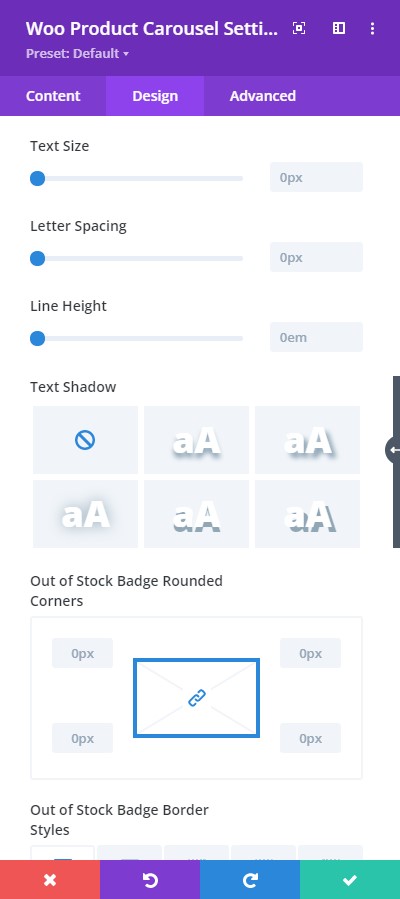
Design tab → Out Of Stock Badge
- Text Size – resize the text
- Letter Spacing – Adjust the spacing between the letters of the text
- Line Height – adjust the space between multiple lines added to the design
- Text Shadow – add a shadow to the text
- Out of Stock Badge Rounded Corners – include rounded corner by adjusting the four corners
- Out of Stock Badge Border Styles – add a border to any side you like or have borders on all four sides
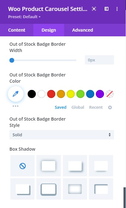
Design tab → Out Of Stock Badge
- Out of Stock Badge Border Width – adjust the width of the border
- Out of Stock Badge Border Color – select a color for the border
- Out of Stock Badge Border Style – include a style to the border
- Box-shadow – add a box-shadow to the element
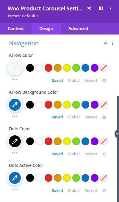
Design tab → Navigation
- Arrow Color – Choose a color for the Arrows
- Arrow Background Color – Choose a background color for the Arrows
- Dots Color – Select a color for the Dots
- Dots Active Color – Select a color for the Active Dot