Mini Cart Feature
Do you want to improve the customer experience of your eCommerce store? With Woo Essential’s Woo Mini Cart feature, you can quickly increase your conversion rate. Have your customers add items to the mini cart that appears in the top right corner.
Note: As of now, The Mini cart feature only supports the Divi Header. It is accessible with the Divi Theme Customizer settings.
For the custom header, the “Mini Cart” feature is unavailable at this moment. We have Good news for our customers that very soon “Mini Cart” will be released as a separate module in Woo Essential plugin, and you can add the “Mini Cart” as a module within your custom header.
Where can you find the Mini Cart Feature?
First, we’ll discuss where you can locate the Mini Cart Feature.
Here we presented a screenshot of the Dashboard. On the left side of the screen, scroll down to Divi and go to Theme Customizer.
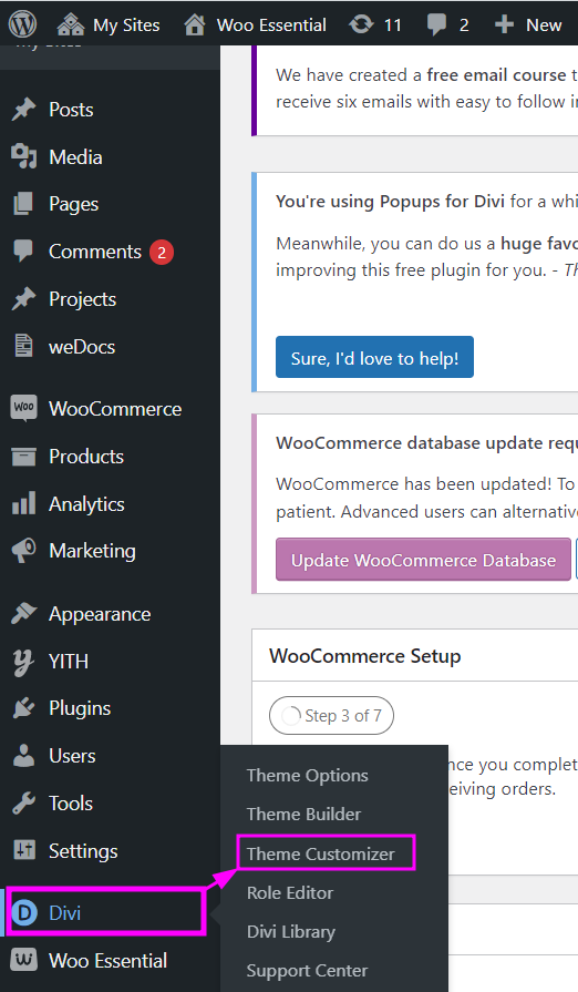
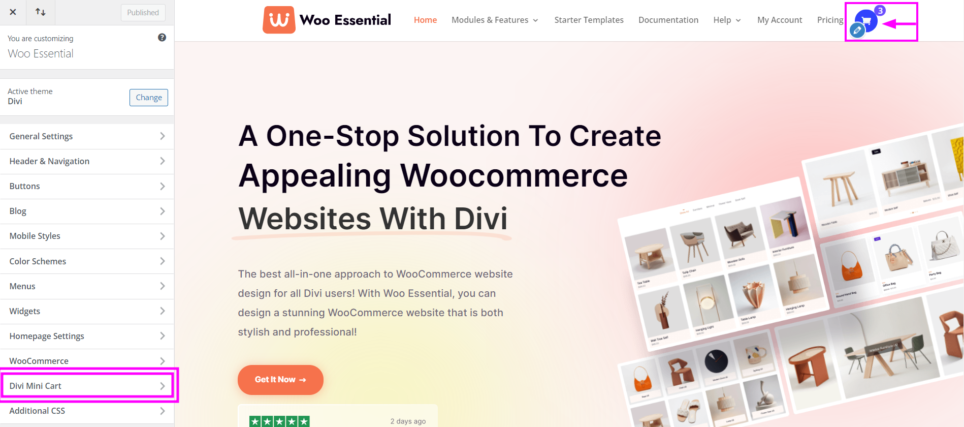
Divi → Theme Customizer
Within the above image, the Divi Mini Cart Feature is present in the left column along with the other extensions. Once clicked, you will then head to the Mini Cart Settings.
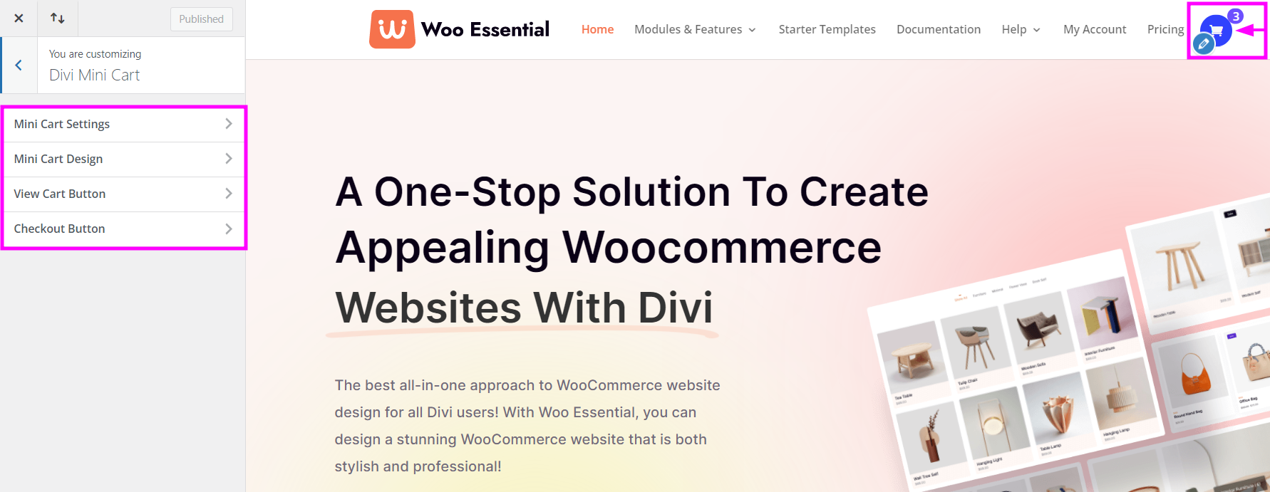
These are the FOUR versatile settings present in the Divi Mini Cart feature:
- Mini Cart Settings
- Mini Cart design
- View Cart Design
- Checkout Button
Let’s go over the details for each of them.
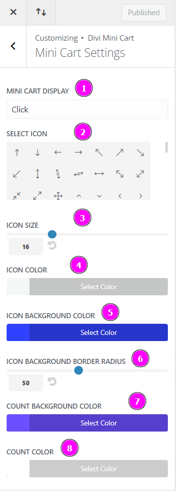
Mini Cart Settings
- Mini Cart Display – if the display is set on click, the visitor needs to click on the mini cart icon to view the mini cart.
- Select Icon – select an icon for the mini cart from the collection.
- Icon Size – resize the icon that you have selected using the slider.
- Icon Color – select a color for the icon.
- Icon Background Color – select a color for the background of the icon.
- Icon Background Border Radius – select a background color for the border of the Icon’s background.
- Count Background Color – when products are selected there will be a product count, you can select a background color for the count.
- Count Color – select a color for the count
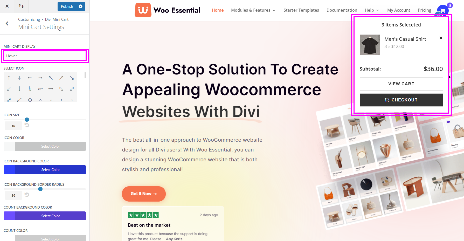
Mini Cart Display → Hover
What happens when you set the mini cart display to hover?
As you hover on the mini cart icon, the list of items will automatically show up in a dropdown. This simple feature is considered quite trendy and is proven eye-catching for visitors.
- Mini Cart Display – visitors should hover on the mini cart icon to view the mini cart if the mini cart display is on hover.
- Select Icon – select an icon for the mini cart from the collection.
- Icon Size – resize the icon that you have selected using the slider.
- Icon Color – select a color for the icon.
- Icon Background Color – select a color for the background of the icon.
- Icon Background Border Radius – select a background color for the border of the Icon’s background.
- Count Background Color – when products are selected, there will be a product count, you can pick a background color for the count.
- Count Color – select a color for the count.
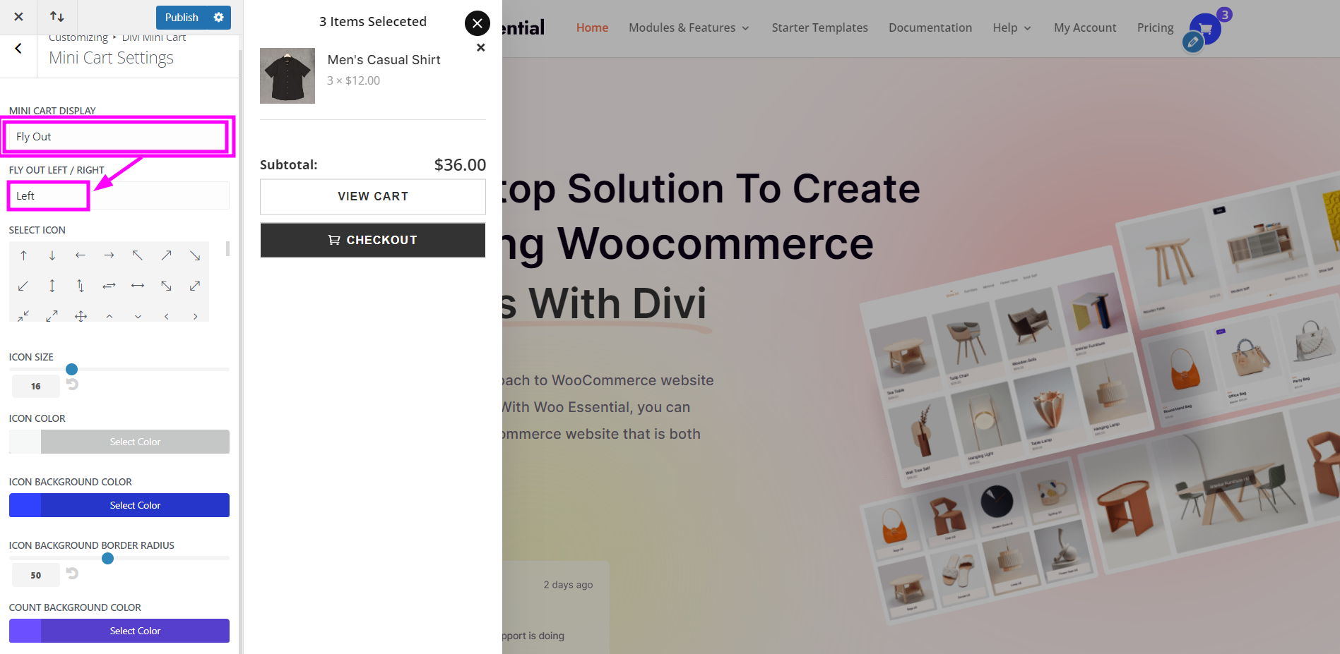
Mini Cart Display → Fly Out (Left)
When clicking the mini cart, the cart will appear as a lightbox on the left side of the screen.
- Mini Cart Display – visitors should click on the mini cart icon to view it as a Fly Out format, the mini cart will then show up in a lightbox on the left side of the screen.
- Select Icon – select an icon for the mini cart from the collection.
- Icon Size – resize the icon that you have selected using the slider.
- Icon Color – select a color for the icon.
- Icon Background Color – select a color for the background of the icon.
- Icon Background Border Radius – select a background color for the border of the Icon’s background.
- Count Background Color – when products are selected, there will be a product count, you can pick a background color for the count.
- Count Background Color – select a background color for the count.
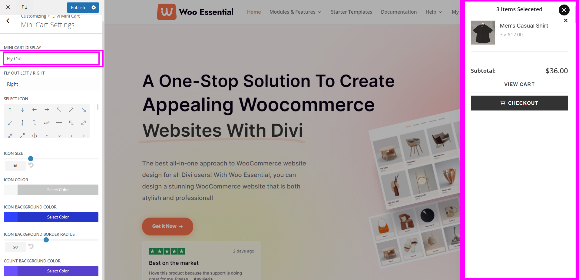
Mini Cart Display → Fly Out (Right)
When clicking the mini cart, the cart will appear as a lightbox on the right of the screen.
- Mini Cart Display – visitors should click on the mini cart icon to view it as a Fly Out format, the mini cart will then show up in a lightbox on the right side of the screen.
- Select Icon – select an icon for the mini cart from the collection.
- Icon Size – resize the icon that you have selected using the slider.
- Icon Color – select a color for the icon.
- Icon Background Color – select a color for the background of the icon.
- Icon Background Border Radius – select a background color for the border of the Icon’s background.
- Count Background Color – when products are selected, there will be a product count, you can pick a background color for the count.
Count Color – select a color for the count.

Mini Cart Design
- Mini Cart Window Background – select a color for the mini cart window/box that appears when the icon is clicked.
- Mini Cart Window Width – adjust the width of the cart window using the slider
- Cart Heading Font Size – resize the font for the Heading using the slider
- Cart Heading Font Color – select a font color suitable for the heading
- Image Size – resize the images of the products added using the slider
- Title Font – resize the title font of the products using the slider
- Title Font Color – select a color for the font of the title
- Title Font Size – resize the title font using the slider
- Quantity Price Font Color – select a color for the quantity price
- Quantity Price Font Size – resize the font size of the quantity price
- Item remove button color – select a color for the remove item button
- Subtotal font color – select a color for the subtotal font
- Subtotal font Size – resize the subtotal font using the slider
- Subtotal Price Font Color – select a color for the subtotal price font
- Subtotal Price Font Size – adjust the size of the subtotal price font
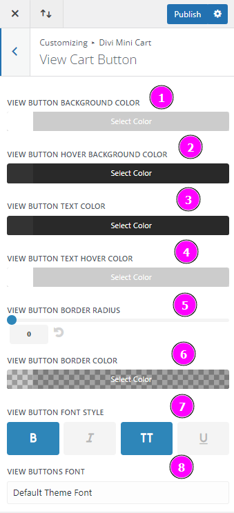
View Cart Button
View Cart Button allows the visitors to view the cart on a separate page. Here, we will discuss the design options for View Cart Button:
- View Button Background Color – select a background color for the view cart button
- View Button Hover Background Color – choose a color for the hover feature of the view cart button
- View Button Text Color – choose a color for the view cart text
- View Button Text Hover Color – pick a color for the hover feature available in the view
- View Button Border Radius – add a rounded corner by adjusting the border-radius
- View Button Border Color – select a color for the border
- View Button Font Style – pick a style of font for the view cart button to make it eye-catching and attractive
- View Buttons Font – select a trendy font for the view cart button
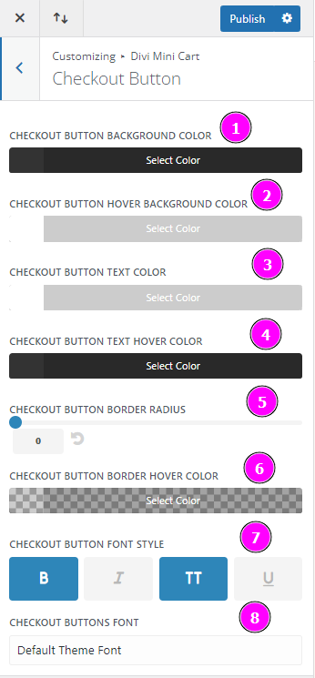
Checkout Button
The checkout button allows visitors to place an order. This feature button leads to the page where they will need to give information on how they would like to make the payment.
- Checkout Button Background Color – pick a background color for the checkout button.
- Checkout Button Hover Background Color – select the hover background color. Your preferred color will appear when you hover over the checkout button.
- Checkout Button Text Color – select a text color for the checkout button.
- Checkout Button Text Hover Color – select the color of the checkout hover text. When the cursor hovers over the text, the color will change.
- Checkout Button Border Radius – adjust the corners to form a rounded corner or square.
- Checkout Button Border Hover Color – pick a color for the border that will show when hovering over the checkout button.
- Checkout Button Font Style – choose a suitable font style for the checkout button.
- Checkout Buttons Font – select a trendy font for the checkout button.
