Utilize Woo Category Masonry to categorize and organize the products on your e-commerce website. The results are stunning!

Content tab → Content
- Hide Empty Category - enable to hide the empty product slots
- Thumbnail Size - select a precise size for showcasing the products. Either in Full, Medium, or Woocommerce Single
Content tab → Content
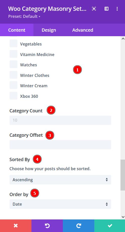
- Include Categories - select the categories you want to show or select all categories to show all the products added
- Category Count - select a number of categories for every slide
- Category Offset - pick a number for how many products you want to omit from the first
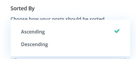
- Sorted by - choose how you want the products to be sorted. Either go for Ascending or Descending
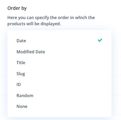
- Order By - There are at least 7 ways to order the products, select the one you prefer

Content tab → Display
- Show Product Count - enable to show product count
- Category Name Stacked - enable to show category name stacked

Content tab → Content Background
- Background color - select background fill color or gradient for the content.

Design tab → Image Settings
- Image Rounded Corners - include rounded corners to the image for all products
- Image Border Styles - add borders to all or particular sides of the image
- Image Border Width - adjust the width of the border you have added

Design tab → Image Settings
- Image Border Color - add a beautiful color of your choice to the borders
- Image Border Style - select a style for your borders
- Box-shadow - add a box-shadow to the images

Design tab → Image Settings
- Image Hue - adjust image hue using the slider
- Image Saturation - adjust the intensity of the image
- Image Brightness - configure the brightness of the image
- Image Contrast - include contrast to the image
- Image Invert - use this to shift to an inverted image

Design tab → Image Settings
- Image Sepia - adjust to apply sepia color tone to the image
- Image Opacity - adjust the opacity of the image
- Image Blur - add blur to the image
- Image Blend Mode - Select from the 16 types of image blend mode for a quick configuration

Design tab → Grid
- Grid Number - adjust the slider to measure the grid number
- Grid Gap - adjust the gap between the elements

Design tab → Category (Name | Count)
- Font - Choose a font. All Google web fonts are available here. You can upload a custom font as well.
- Font Weight - select the weight of the font from Light to Ultra Bold
- Font Style - select a font style from
- Text Alignment - align the text to left, right, or center
- Text Color - pick a color for the text
- Text Size - resize the text

Design tab → Category (Name | Count)
- Letter Spacing - Adjust the spacing between the letters of the text
- Line Height - adjust the space between multiple lines added to the design
- Text Shadow - add a shadow to the text
- Content Wrapper Rounded Corners - include rounded corner by adjusting the four corners

Design tab → Category (Name | Count)
- Box-shadow - add a box-shadow to the element
- Content Wrapper Border Styles - add a border to any side you like or have borders on all four sides
- Content Wrapper Border Width - adjust the width of the border

Design tab → Category (Name | Count)
- Content Wrapper Border Color - select a color for the border
- Content Wrapper Border Style - include a style to the border